My Top 5 Website Pet Peeves + Quick Fixes!
My Top 5 Website Pet Peeves + Quick Fixes!
Let’s talk website pet peeves…because why not? In a quick five minutes, you could take your website to the next level by scanning for these mistakes and making the following simple fixes!
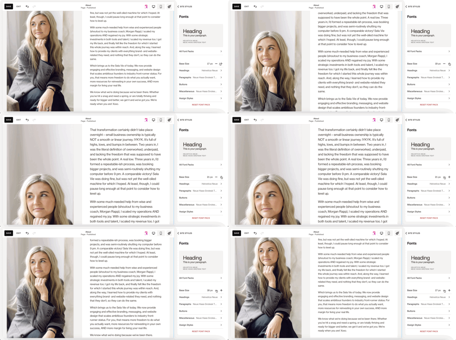
1. Massive text on a website!
Make your font sizes smaller, and then again! Nothing screams DIY more loudly than huge body copy.
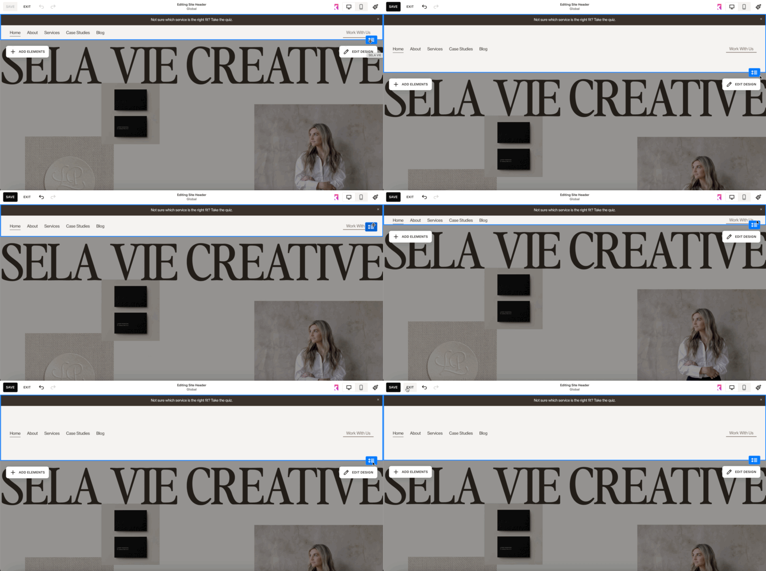
2. Tall website headers—
your navigation bar does not need to take up much vertical space. You want your first banner section to be the main focus!
3. Too much copy without imagery in between.
Make sure you space out copy with images and/or video content and other visual aids (illustrations, graphics, etc.).
4. Not listing what you do/sell in words at the very top of your Home page.
Before users scroll at all, they should have a clear understanding of what you offer and why they’re on your site.
5. Broken links or outdated/inaccurate content.
Regularly check and update your website to ensure all links are functional and content current!


