Summer with Sela Vie Week 4
Grow your email subscriber list by adding a freebie pop-up from Flodesk!
Begin by signing into your Flodesk account and crafting a custom pop-up form tailored to your needs. Then, here’s how to integrate the pop up onto your site—
Squarespace—
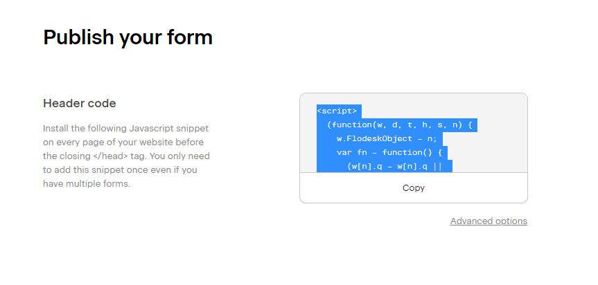
Once you've finished personalizing the form, you'll be provided with a header code snippet that you need to add to your Squarespace website. Make sure to copy this code.
Next, head over to your Squarespace website and follow this path: SETTINGS > ADVANCED > CODE INJECTION.
Once you're there, paste your copied Flodesk header code in the HEADER section. To finalize the process, click SAVE in the top right corner. You've now successfully integrated your Flodesk popup form with your Squarespace site!
Shopify–
Step 1:
After customizing your pop up, you'll receive a code snippet. This needs to be added to your Shopify website to display the form for subscribers.
Step 2:
In your Shopify dashboard, navigate to Themes > Current theme > Customize under "Online Store".
Step 3:
Click the three dots in the upper left corner and select Edit code.
Step 4:
In layout, click theme.liquid.
Step 5:
Paste the popup code snippet right before the </head> tag.
Step 6:
Click Save in the top right corner and return to your Theme.
This week’s Q&A: Caroline Borders
on creativity and content creation
Q: How do you make content that stands out visually? Your content is over-the-top creative, and we need to know how to think/create like you!
You're very kind, thank you! My background in graphic and interior design definitely shapes how I create content for myself and businesses. Here are my key tips for creating visually appealing and effective content:
Know Your Audience: Understand what you're marketing and who you're targeting. What resonates with them? If you're promoting something popular, think of a fresh angle. For example, if you're marketing a purse, show it styled by trending celebrities or in collages with like-minded brands. Cross-marketing is always effective.
Typography and Space: Strong typography and smart use of space are essential. Mix serif and sans serif fonts, play with sizes, and leave room for the design to "breathe." Typography is a powerful way to convey tone and identity.
Consistency: Whether for personal or business use, your visual identity should be instantly recognizable. Stick to a consistent color scheme, fonts, and logo. Create a steady flow of content to establish relevance and familiarity, focusing on quality over quantity.
Q: When it comes to creating content for your own brand, how do you decide what to share?
I only share what I love and find useful, and I believe my audience appreciates that in today's noisy environment. Since I create for clients day and night and am now a mom, creating content for my personal page is a lower priority. However, it fuels my creativity, especially through rewarding partnerships. Collaborating excites me.
When deciding what to share, I consider:
Will this add value to my audience?
Does it feel authentic and fit naturally into my lifestyle?
Can I meet the brand's expectations and visually tell a compelling story within their requirements and timeline?


